


Responsive Image Grids with Transitional Effects when Hovered
Responsive image grids, or image gallery with fluid rows & columns, can be seen all over the web nowadays.
Let's built it with pure CSS/CSS3. No fancy dancy JavaScript or jQuery needed.
- CSS3 will be used for the mouse-over transitional effect. It degrades nicely for legacy browsers such as IE6 - IE8
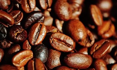
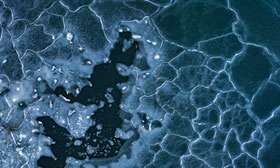
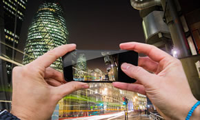
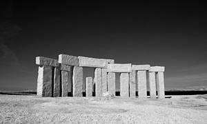
- The demo contains 12 images. If you want to use an image sprite (only one image) to help with performance, please refer to the demo 2.
HTML
<ul id="rig">
    <li>
        <a class="rig-cell" href="#">
            <img class="rig-img" src="/rg/img/1.jpg" />
            <span class="rig-overlay"></span>
            <span class="rig-text">Lorem Ipsum Dolor</span>
        </a>
    </li>
    ...more...
</ul>
- UL - LI structured
- Each grid item, the LI, contains an element with class="rig-cell". It can be an anchor, a DIV, or any other tags.
-
The cell wraps other elements.
In this demo it contains an image (class="rig-img"), a layer to be shown when hovered (class="rig-overlay"), and a layer for showing image captions (class="rig-text").
You can add as many layers as you like.
CSS
-
li
It has a default width: {width:25%;}, and it is tailored to different column numbers for different output devices. For example:@media (max-width: 800px) { #rig li { width:50%; } } -
.rig-cell
If you like, you can add margin, border, padding, box-shadow styles to it. Do not add those styles to the LI element. -
.rig-img
Its style {width:100%;} makes the image responsive: always fits into the cell. -
.rig-overlay & .rig-text
You can style them to whatever you want with CSS3 animated hover effect.
Note: The UL has been set with {font-size:0;} to avoid unwanted gaps between the cells. It is important to set the font-size back if you have text content here, i.e.:
.rig-text {font-size:14px;}